Tuesday 8 April 2014
FINAL EVALUATION QUESTION 3.
What kind of media institution might distribute your media product and why?

Bauer Media
Bauer Media is a division of the Bauer Media Group, Europe’s largest privately owned publishing Group. The Group is a worldwide media empire offering over 300 magazines in 15 countries, as well as online, TV and radio stations.
Publishing is the process of production and releasing of a magazine, which makes it available to the public. This includes the stages of development, editing, graphic design and printing. Marketing and distribution is included within the publishing of a magazine. I chose Bauer Media Group as my publishing company as they have a good reputation of publishing magazines. Bauer Media publish such magazines as Closer, GRAZIA, Q, KERRANG! etc.
GRAZIA is quite close to my magazine, other than it is about fashion and BEAT is about music. The style and layout are quite similar. Q will feature some of the same genre of artists in their magazine as BEAT. I've linked these together to create BEAT, a music magazine made fro the audience of 16-24 year old females. As this is my target audience, I have priced BEAT at £2, which is within their price range. Grazia is currently priced at £2 per issue and Q is priced at £3.99 per issue, with this in mind, Q is a larger magazine with a lot more content inside.
Bauer will publish BEAT but will also help in all other areas as well. It will help fund BEAT. This will be done by slotting a copy of BEAT into their previously owned music magazine Q. This will give BEAT some recognition within the targeted audience and also generate some funds towards making it a solo magazine. This will be done by competitions to raise the money as they will know by this how many potential readers they may recieve.
As Q is sold in many supermarkets around the UK, I feel that this would be a beneficial place to start selling BEAT as I feel that most magazines are brought through supermarkets. BEAT will also have an online website where readers can subscribe to the magazine and find out more about competitions and artists featured inside.
Bauer Media Group will also advertise BEAT on their website to try and gain more recognition for the magazine. This will help a lot more people know about BEAT if they haven't already as Bauer Media Group is quite a well known company. Being involved in Bauer Media Group will also be ideal for BEAT magazine as they have quite a lot of contacts as they are a major publishing company. This means that BEAT can use Bauer's distribution and management contacts.
Bauer's current magazine's are quite popular. Grazia magazine sells an average of 218,000 copies per month, Q magazine sells around 52,781 per six months, Kerrang! 37,603 per month, Closer 351,632 per month. I am aiming for BEAT to be as successful because I think it has the potential to be successful as it follows most of the conventions of a popular pop magazine.

Thursday 20 March 2014
DRAFT EVALUATION ACTIVITY 1
In what ways does your media product use, develop or challenge forms and conventions of real media products? (i.e. of music magazines)
The title of the magazine:
My title of my magazine (Beat) is short, but not too short. It has stuck with the convention of having a title that is not too long, that it needs shortening, as most magazine titles are either short or shortened e.g. NME and Q. I chose the title BEAT because of its reference to music, this was to show that my magazine it a music magazine, as the cover would not suggest that it was as model is not making any reference to music.
For the font of my masthead, I have kept it plain and simple as I think that it needs to stand out but not take over the whole cover page because during my research I had seen that the magazines that I had liked and taken inspiration from, had made the image a major part of the cover, not just the masthead. I used the font Letter Gothic Std because of its square-like nature, I think that as my magazine is quite clean cut, I needed a plain background that is "blocky" enough to stand out but it is not very thick, so it is not blocking the image much in the background.
Another convention I did not follow was having the masthead behind the model on the cover. I did not believe this to be very effective within my magazine because I didn't think that it would benefit from it. All that would be covered would be a little bit of the E and the A as my model does not cover the entire page. I think that having the mast head in front, but not covering the face ensures that the masthead is eye-catching but so is the face of the model.
Graphology/page layouts:
I have used a very clean cut page layout, which I think is consistent throughout my magazine. I have used the rule of thirds in my magazine cover to make sure that the image is central within the page. I have taken this idea from many magazines such as Cosmopolitan and Billboard.


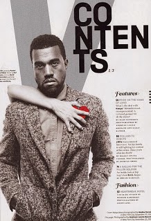
For my contents page, by only using one column of text and a larger picture, I thought I was breaking the conventions of a magazine as a majority of magazines nowadays have either two or three columns and the pictures are smaller and they have more than one artist on them. Although, I have found quite a few contents pages from magazines like Spin and V who have also gone away from the conventions that I just mentioned.


Costumes, props, iconography used to reflect genre:
I have used a very clean cut page layout, which I think is consistent throughout my magazine. I have used the rule of thirds in my magazine cover to make sure that the image is central within the page. I have taken this idea from many magazines such as Cosmopolitan and Billboard.
For my contents page, by only using one column of text and a larger picture, I thought I was breaking the conventions of a magazine as a majority of magazines nowadays have either two or three columns and the pictures are smaller and they have more than one artist on them. Although, I have found quite a few contents pages from magazines like Spin and V who have also gone away from the conventions that I just mentioned.
Costumes, props, iconography used to reflect genre:
With the styling within my magazine, I have gone for a very simplistic approach. I don't think there is a convention of styling within a magazine cover. Some magazines have very extravagant clothes posted on their cover whereas other magazines make it mostly about the face of their artist, not what they are wearing. I think I have followed this as I have made the face of my model stand out as much as possible by using quite simple clothes with not much colour.
Genre and how the magazine cover, contents and spread suggests it:
For this, I think that I have followed the conventions of most music magazines, in which they do not show that the artist on the cover is actually in the music business. Mostly women on music magazine covers pose in a typical photo shoot, this is to make them look more appealing and have the male gaze. I have followed this convention as my model is posing. All in all, this does not reflect the genre at all as there is no significance to music, but it is a convention of a music magazine I think.
Camerawork and framing of images:
For my camerawork I have made sure that my model is looking straight towards the camera. This is a convention of women photo shoots as it gives the photo the element of the male gaze. I think that it makes the photograph more inviting and interesting.
For the framing of images, in the magazines I have studied, I found that a lot of them framed the photograph in writing about the other artists featured in the magazine, where as I have created a line under my subheading and named a few artists that are featured. This then breaks this convention as I have not added anything onto the cover that describes anything in detail that is inside the magazine.
Title, article, header etc font and style:
For my fonts, I have chosen very plain and simple fonts for all of my contents page, cover page and double page spread. I think that this is because for this type of magazine, which has taken a simplistic approach, I do not think fancy writing would suit it.
For my masthead I chose to use Letter Gothic Std as this is a very plain writing that holds its own and stands out on my cover page.
Colour scheme:
I have used a basic colour scheme of red, white and black. This is sticking to the convention of having subtle colours that blend well together on all pages of my magazine.
I have used a basic colour scheme of red, white and black. This is sticking to the convention of having subtle colours that blend well together on all pages of my magazine.
DRAFT EVALUATION ACTIVITY 2
How does your media product represent particular social groups?
In order to capture the correct image that I wanted my artist to portray, I used details from already famous artists and photo shoots that they are well known for. For example...

Also, from this photo of Jessie J, I have taken the idea of lipstick. I like how Jessie has got lips that really stand out because of the colour. This was vital in my magazine as I have cloned the colour of Katy's lips on most of my pages to the masthead or title so it is important that they stand out.


I have taken inspiration for my contents page photo from these photos of Rita Ora and Miley Cyrus. I like the way that they have included their clothes into their pose. I like this idea as mostly, clothes are forgotten in photo shoots, whereas these two photos really do draw attention into the clothes.

From this photo of Rihanna, I have taken Katy's pose on my cover page. I really like how expressionless Rihanna's face is in this, so I took inspiration from it. I made Katy have her mouth open a little, like Rihanna as I think this expands the male gaze.
Also from this I have taken Rihanna's hair. Katy does not have the same hair as Rihanna but I have taken the size from Rihanna. In this photo, Rihanna has quite large hair and I wanted to imitate that in my photos of Katy as I like her hair and I wanted to make it as big as possible.

In terms of styling, I have taken inspiration from Nina Nesbitt in this photograph. I like the styling of this photograph as I feel it is as simple as it can be. The main focus of this photograph is Nina's face as none of the spotlight is taken by her clothing. I wanted to take this and apply it to my cover photo, I wanted the image to be about Katy's face and not what she was wearing. This is why I had her dress in a plain white top.
DRAFT EVALUATION ACTIVITY 3
What kind of media institution might distribute your media product and why?
Bauer Media
Bauer Media is a division of the Bauer Media Group, Europe’s largest privately owned publishing Group. The Group is a worldwide media empire offering over 300 magazines in 15 countries, as well as online, TV and radio stations.
Publishing is the
process of production and releasing of a magazine, which makes it available to
the public. This
includes the stages of development, editing, graphic design
and printing. Marketing and distribution is included
within the publishing of a
magazine. I chose Bauer Media
Group as my publishing company as they have a good reputation of publishing magazines. Bauer Media publish such magazines as Closer, GRAZIA, Q, KERRANG! etc.
GRAZIA is quite close to my magazine, other than it is about fashion and BEAT is about music. The style and layout are quite similar. Q will feature some of the same genre of artists in their magazine as BEAT. I've linked these together to create BEAT, a music magazine made fro the audience of 16-24 year old females. As this is my target audience, I have priced BEAT at £2, which is within their price range. Grazia is currently priced at £2 per issue and Q is priced at £3.99 per issue, with this in mind, Q is a larger magazine with a lot more content inside.
Bauer will publish BEAT but will also help in all other areas as well. It will help fund BEAT. This will be done by slotting a copy of BEAT into their previously owned music magazine Q. This will give BEAT some recognition within the targeted audience and also generate some funds towards making it a solo magazine. This will be done by competitions to raise the money as they will know by this how many potential readers they may recieve.
As Q is sold in many supermarkets around the UK, I feel that this would be a beneficial place to start selling BEAT as I feel that most magazines are brought through supermarkets. BEAT will also have an online website where readers can subscribe to the magazine and find out more about competitions and artists featured inside.
Bauer Media Group will also advertise BEAT on their website to try and gain more recognition for the magazine. This will help a lot more people know about BEAT if they haven't already as Bauer Media Group is quite a well known company. Being involved in Bauer Media Group will also be ideal for BEAT magazine as they have quite a lot of contacts as they are a major publishing company. This means that BEAT can use Bauer's distribution and management contacts.
Bauer's current magazine's are quite popular. Grazia magazine sells an
average of 218,000 copies per month, Q magazine sells around 52,781 per six months, Kerrang! 37,603
per month
Closer 351,632 per month. I am aiming for BEAT to be as successful because I think it has the potential to be successful as it follows most of the conventions of a popular pop magazine.
Wednesday 19 March 2014
DRAFT EVALUATION ACTIVITY 4
Who would be the audience for your media product?
 This is Georgia Spanner. She is 17 years old and attends College and is studying Art. She lives in Central London. She makes sure that every week, she purchases a copy of Billboard on her way home from college. This is so that she is up to date in the pop-music world and she likes to read about her favourite pop artist like Katy Perry, Miley Cyrus and One Direction.
She has been to see all of these artists in concert and plans to go see them all again in the near future. Georgia has a twitter where she blogs all of her thoughts and feelings and has a large amount of followers because of the reviews of the concerts she goes to on her twitter.
As Georgia is only in college, she will only pay around £3 for a weekly magazine, £5 for a monthly copy.
Georgia likes to shop is places like Top Shop, New Look, American Apparel, Urban Outfitters and River Island. This is because at the weekends, to help her afford to go to concerts, she works at her local New Look every Saturday.
In a magazine, Georgia looks for her favourite artists on the cover. She likes it when the cover is based on one person, not having lots of small images around the outside as she thinks this looks messy. She does not like lots of writing on a magazine as it is too much and she thinks it takes away from the main image.
This was my audience profile that I made before I started to make my magazine. I think that I have based my magazine a lot on what I had said in this audience profile. I have made my magazine to fit this girls profile very closely.
I think that Georgia would buy my magazine as I have thought about her price range and priced my magazine at just £2 so that all of my target audience (16-24 year old girls) would be able to afford it. Also, I have taken a lot of artists from the artists that Georgia likes as she has described that she likes Katy Perry, Miley Cyrus and One Direction, many of these are featured in my magazine. This is important for my target audience as they will buy the magazine based on who is featured in a magazine. For myself, being in this age range, I can say that if my favourite artist was in the magazine or on the cover, I would be more interested in buying the magazine as if they wasn't.
On this it mentions that Georgia has a twitter account and follows a lot of her favourite artists on twitter. I added onto the bottom of my article where girls like Georgia who have twitter accounts can follow the up and coming artist that I have featured in my article.
DRAFT EVALUATION ACTIVITY 5
How did you attract/address your audience?

I used the correct pop alternative conventions on my magazine by using a female model posing on the cover. This used the convention of the male gaze as my model is posing in quite a sexual and inviting way. This was not for the attraction of males, but to make my model look as appealing as I can as in many pop alternative magazines, women use the male gaze in their photographs but not for males.
By using the correct conventions when producing my magazine it has attracted my target audience of 16-24 year olds.
The use of bold and eye catching colours attracts my audience as they help make the photograph stand out on the page. Especially as the main selling point of my magazine is my artist. I have to use a well-known artist or an up and coming artist that isn't quite famous but getting there as it will help attract my readers in. In my magazine, I have used an up and coming artist on my front cover, but to make my magazine look more appealing to my audience, I have added names of known artists that will feature in the magazine as I feel that this will grab the readers attention and make them want to buy my magazine, if the person on the cover hasn't sold it to them.

DRAFT EVALUATION ACTIVITY 6
What have you learnt about technologies from the process of constructing this product?

Macbook Pro: I used a Macbook for editing my magazine. This was a new experience for me as I had never used a Mac before. I had to learn how to use all of the features of the Mac pretty quickly, so that I could start editing my magazine. I think that this really helped me with the making of my magazine as it is a fast and effective piece of hardware. The only problem was that my work was only saved on this computer, it would not automatically transfer to other computers around the school, this inhibited me a little, but fortunately not a lot.

Blogger: Blogger is an online website that lets users write "posts" and post them on the internet for everyone to see using their own URL. I have used blogger to all the way through my project to show my work to my teachers and peers. I blogged every part of my coursework from my research, planning, mock products, final drafts and now, my evaluation. I had used this website before this project but as I used it a lot more in this project, I gained a greater understanding of it and now can fully use this website. I really like this website, its easy to use and has really helped me with my coursework as my friends could comment on posts i'd made to leave feedback.

Tripod: I used a tripod whilst taking my photo's. This is because I wanted my photographs to be very symmetrical. Especially for my cover, it was essential that the picture was not wonky or off balance. Using the tripod was essential when taking my photographs, I like this piece of equipment, it helped me a lot.

Safari: I used Safari to access my "Blogger" URL so that I could post a lot about the planning and making of my magazine. It was also an essential piece of software whilst I was doing my research as it enabled me to use the website "Google" to find different inspirations. Also, it enabled me to use coverjunkie and UKTribes
Photoshop: I had never used photoshop before this project, but it was absolutely essential that I used it. It helped me cut out particular parts of photos using the lasso tool and remove backgrounds from an image. I edited my photos on Photoshop using the brightness and other image manipulation features. I also learnt how to remove blemishes from Katy's face e.g. Smile lines

Animoto: I used Animoto to present my 25 word pitch to my class on. I think that this helped me quite a lot as it was easy to use and gave me lots of different ways to present my work that was different to other websites that I'd used previously.

Microsoft Word 2010: I used Microsoft Word to type out my article as I used to spell-checker tool to make sure that there was no mistakes in my article as photoshop or blogger would not pick this us. I had used Microsoft Word a lot before this project so it was very easy to use

Flickr: When I had taken my draft photographs of Katy, I created a slideshow on Flickr of all of my photographs so that I could post them on my blog in a new and creative way so that I can get feedback on them

Soft lighting boxes: I used the soft lighting boxes when I was taking my photographs as it was essential that the lighting was done professionally and not just using flash on the camera. This was so that my photographs were properly lit so that when I opened them up in photoshop, there was no shadows on them as my photographs needed to be crisp to fit in with my magazine

SurveyMonkey: I used survey monkey to create a questionnaire to gain feedback from my peers about what music magazines they typically buy and what they look for in a music magazine. I also received feedback from my questionnaire about the idea of my magazine and what they thought of the name BEAT for my masthead

CAMERA: I used the Nikon D3200 camera as it made my photographs that I took of Katy look very professional as it is a high quality camera and would highlight and capture every part of Katy's face perfectly. I had never used a professional camera before but this camera was easy to use and really aided me in taking some good pictures.
DRAFT EVALUATION ACTIVITY 7
Looking back at your preliminary task (the school magazine task), what do you feel you have learnt in the progression from it to full product?
I think that as a whole, all of my skills of making a magazine have improved.
For example, as you can tell from my photographs I have taken. For my preliminary task, I used my camera phone to take the photo, which was in the school cafe, whereas for my final magazine photographs I took my photos in a properly lit camera room with soft lighting boxes with a professional camera.
Also by the poses I think I have improved, Izzy in my preliminary photo is standing awkwardly eating a naan bread whilst looking towards the camera where as Katy in my final magazine has the element of the male gaze and does not look awkward at all.


For example, my photoshop skills have improved dramatically. When I was making my mock-up and preliminary task, I had barely used photoshop before, which means that I didn't use a lot of the features on photoshop as I didn't know how. This meant that my preliminary task and my mock-up really only used the basic features of photoshop so they lacked style and were extremely simple. I have learnt how to use photoshop now so my skills have increased dramatically and I can now use all features to their full extent.
I also had never heard of the rule of thirds, which I have used throughout my final magazine. On my preliminary task and my mock up, there was nothing that was eye catching or even central. Everything was too big, especially the barcode. I have learnt the important parts of a cover page. In my preliminary task my barcode was massive and it didn't have a date or an issue number on it, I have changed this for my final magazine.
For my masthead in my final piece, it took quite a long period of time to find a font that I think suited my magazine cover and my contents page as I needed a font that was not too thick so that it did not cover Katy's face. This shows I have improved from my mock up as the WHOA is way too thick and takes away from Rihanna's face. Also, in my preliminary task the colour of the masthead does not quite fit with the picture, it doesn't stand out enough for me. This shows that I needed to spend time finding a balance between the two.
For my wardrobe in my preliminary task, I had Izzy just wear her normal clothes. She had her bag and her lanyard on, this I don't think is acceptable for a magazine cover. In my final piece, I thought long and hard about what to have Katy wear as I realised how important it is to style my model.
In my preliminary task, I did not think about the background and just used the background of the picture, which was the cafe. This really took away from Izzy as there are other things to concentrate on in the picture, not just the model. I really improved this in my final magazine as I got rid of all backgrounds and shadows to make sure that Katy is the main thing to look at on my cover.


For example, as you can tell from my photographs I have taken. For my preliminary task, I used my camera phone to take the photo, which was in the school cafe, whereas for my final magazine photographs I took my photos in a properly lit camera room with soft lighting boxes with a professional camera.
Also by the poses I think I have improved, Izzy in my preliminary photo is standing awkwardly eating a naan bread whilst looking towards the camera where as Katy in my final magazine has the element of the male gaze and does not look awkward at all.
For example, my photoshop skills have improved dramatically. When I was making my mock-up and preliminary task, I had barely used photoshop before, which means that I didn't use a lot of the features on photoshop as I didn't know how. This meant that my preliminary task and my mock-up really only used the basic features of photoshop so they lacked style and were extremely simple. I have learnt how to use photoshop now so my skills have increased dramatically and I can now use all features to their full extent.
I also had never heard of the rule of thirds, which I have used throughout my final magazine. On my preliminary task and my mock up, there was nothing that was eye catching or even central. Everything was too big, especially the barcode. I have learnt the important parts of a cover page. In my preliminary task my barcode was massive and it didn't have a date or an issue number on it, I have changed this for my final magazine.
For my masthead in my final piece, it took quite a long period of time to find a font that I think suited my magazine cover and my contents page as I needed a font that was not too thick so that it did not cover Katy's face. This shows I have improved from my mock up as the WHOA is way too thick and takes away from Rihanna's face. Also, in my preliminary task the colour of the masthead does not quite fit with the picture, it doesn't stand out enough for me. This shows that I needed to spend time finding a balance between the two.
For my wardrobe in my preliminary task, I had Izzy just wear her normal clothes. She had her bag and her lanyard on, this I don't think is acceptable for a magazine cover. In my final piece, I thought long and hard about what to have Katy wear as I realised how important it is to style my model.
In my preliminary task, I did not think about the background and just used the background of the picture, which was the cafe. This really took away from Izzy as there are other things to concentrate on in the picture, not just the model. I really improved this in my final magazine as I got rid of all backgrounds and shadows to make sure that Katy is the main thing to look at on my cover.
Friday 14 March 2014


Subscribe to:
Posts (Atom)